Fewer Words, More Visuals: Infographics to the Rescue
A number of years ago, a new client of mine was interested in introducing a new HR program at her company using an infographic.
“When you say infographics, what do you mean?” I asked.
My client had heard of infographics. She believed infographics were in vogue. She wanted to create one. But she and her colleagues weren’t quite sure what one was. They only knew it was more pictures than words.
Fair enough. At the time, to be honest, I didn’t have a working definition for “infographic” myself.
My next question: Why an infographic? On this point, they were completely certain. “Because we don’t think people are reading our communications,” they said.
Sound familiar?
Data Visualization
Edward Tufte is known as a pioneer in the field of data visualization. His book, The Visual Display of Quantitative Information, is considered a seminal source on statistical graphics, charts and tables.
According to Tufte, a statistician at heart, “data graphics visually display measured quantities by means of the combined use of points, lines, a coordinate system, numbers, symbols, words, shading, and color.” I would consider this a strict – almost scientific – definition of an infographic. It hinges on the notion that one is attempting to communicate quantifiable data. Tufte puts it another way: infographics require “the use of abstract, non-representational pictures to show numbers.”
Here’s an example:
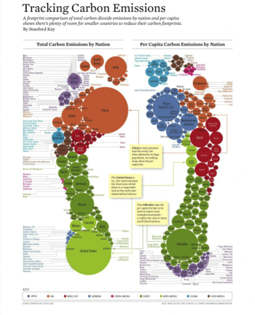
(Created by Stanford Kay, Newsweek’s International Edition)
But let’s be honest. We’re not always trying to communicate quantifiable data. Most of the time we just want to get our message across in the least boring way possible. Can infographics help do that?
In his book, The Power of Infographics, Mark Smiciklas provides a broader characterization of an infographic. He says “infographics are a type of picture that blends data with design, helping individuals and organizations concisely communicate messages to their audience.”
Bingo!
In fact, we see these kinds of infographics everywhere, from subway maps to Ikea furniture assembly instructions to road signs.
Here’s an example of an infographic that’s not so data-driven:
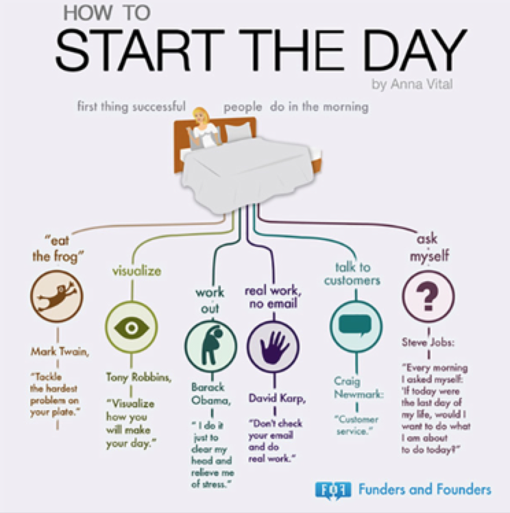
(Created by Anna Vital)
But let’s go back to why my client wanted to employ an infographic in the first place. The company was prompted by a frustration I hear from clients all the time: “We deliver communications to our employees in lots of different ways – they just don’t read it.”
The fact is employers are constantly searching for ways to compel their employees to sit up and say, “Yes, I’ll pay attention to that!” The most common approach is more or different technology – videos, websites, apps, texting, social media. But what about fundamentally changing the way we communicate in certain situations? Fewer words, more visuals. Sometimes the answer is in simplifying the complex.
USA Today
If you’re still not sure, let’s ask it another way: What’s the one thing on the front page of USA Today you are sure to read?
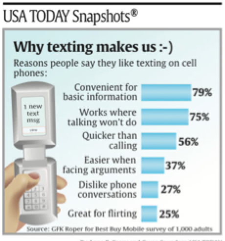
(Created by Anne R. Carey and Gwen Saunders, USA Today)
Started in 1982, USA Today strived to present news information in a simpler, more visual way. While often criticized for oversimplifying the delivery of news, the newspaper’s success can’t be disputed.
USA Today has never tried to be the Wall Street Journal. And, in your employee communications, you probably aren’t either. For my entire consulting career, I’ve heard the following from at least one client every year: “We want our communications to have a more USA Today-feel.” Translation: fewer words, more visuals.
Your employees probably want this, too. Above all, they want simple, clear, easy. The easier the better, they will tell you. We can all take a lesson from USA Today.
Smiciklas argues that infographics work in business for three reasons:
- They are easy to digest. In an age when we skim more than we read, infographics grab our attention more effectively than sentences and paragraphs.
- They are shareable. If we like something, we will share it with others. (Just look at how many people over-share on Twitter, Instagram and Facebook these days.) But to share an article or blog post means one must first read it. The threshold for sharing an infographic is much lower.
- The Cool Factor. Competition for the attention of your employees is greater than ever. As Smiciklas writes, the person you’re trying to connect to with your communication probably spends only a few seconds on your content before deciding whether to move on. Infographics are unique; they help you stand out among the competition. They are…cool.
So, if this is true, why do we still have 30-page benefit guides and complex medical plan comparison grids? Why don’t we use infographics more?
Well, most of us would agree that in some circumstances detailed information can only be delivered in long booklets and complicated charts. However, in other instances, the right answer evokes the famous quote, “If I had more time, I would have written a shorter letter.”
This certainly applies to infographics. Infographics rely on sharp creativity and economy of ideas. For example, let’s compare the table and infographic below.
The Cost of Housecleaning
Following are estimated costs of selected household cleaning services provided by professional household cleaning services in the United States. Costs might be higher for fragile or valuable furnishings, or for large houses, and may vary by region.
| Service | Scope | Cost |
| Draperies and Curtains | N/A | $2/horizontal foot |
| Gutter Cleaning | Average size house | App. $50 or 40 cents/gutter foot |
| Window Washing | Standard sizes inside and out | $5-8/window |
| Carpet Shampoo | 9×12 feet
12×15 feet | $55-105
$80-125 |
| Upholstery Cleaning | Full-size sofa with cushions | $90-130 |
| Fireplace and Chimneys | N/A | $60-125 |
| General Housecleaning | Includes kitchen and bathroom cleanup, laundry, and household tidying | $5-15/hour |
| Furnace and Duct Cleaning | For an average-size house | $50/furnace
$50 for all ducts |
| Self-Navigating, Robotic Vacuum Cleaner | Cleans bare floors and carpets, recognizes walls and other obstacles | $25,000 (CYBERVAC, by CyberWorks, Orillia, Ontario) |
Converting this complex information takes real time, thought and talent.
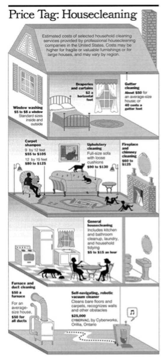
(Created by Megan Jaegerman, The New York Times)
Admittedly, the larger chart provides the reader more detail but is less visually engaging. Clearly, both presentations have a role in your communication.
The reality is that infographics are hard to do, and even harder to do well. One might contend that they are the ultimate marriage of great design and clear content. But that shouldn’t stop us from trying. Begin simply. Fewer words, more visuals. Think USA Today. And then challenge your communication professionals – whether internal resources or external consultants – to do what my client did years ago with me. Demand an infographic. You already know why – because you want your employees to sit up and take notice.