Infographics Design Infographics July 26, 2024 Design in MotionAction, art and language in Olympic pictograms. Pictograms are tidy windows to more than the Olympics. They open wide enough to show us how we know our world. Design in Motion Design Infographics Strategic Communication October 18, 2022 Why Traffic Signs WorkA Lesson in Uniformity for Communicators While novelty and unexpectedness can catch an audience’s attention, successful communication also relies on predictability. Why Traffic Signs Work Infographics August 7, 2019 Make Your Message Obvious(and How to Play a Cmaj7) Guitar Tablature Tells People What to Do, Not Just What to Know About eight years ago, when I finally decided… Make Your Message Obvious Articles Infographics Strategic Communication May 20, 2019 Fewer Words, More Visuals: Infographics to the RescueInfographics to the Rescue Infographics help make the complex understandable and boring data engaging. They aren't easy, but they're worth the effort. Fewer Words, More Visuals: Infographics to the Rescue
Design Infographics July 26, 2024 Design in MotionAction, art and language in Olympic pictograms. Pictograms are tidy windows to more than the Olympics. They open wide enough to show us how we know our world. Design in Motion
Design Infographics Strategic Communication October 18, 2022 Why Traffic Signs WorkA Lesson in Uniformity for Communicators While novelty and unexpectedness can catch an audience’s attention, successful communication also relies on predictability. Why Traffic Signs Work
Infographics August 7, 2019 Make Your Message Obvious(and How to Play a Cmaj7) Guitar Tablature Tells People What to Do, Not Just What to Know About eight years ago, when I finally decided… Make Your Message Obvious
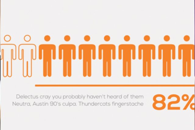
Articles Infographics Strategic Communication May 20, 2019 Fewer Words, More Visuals: Infographics to the RescueInfographics to the Rescue Infographics help make the complex understandable and boring data engaging. They aren't easy, but they're worth the effort. Fewer Words, More Visuals: Infographics to the Rescue