Design in Motion
The 2024 Olympics are opening in just a few hours. I can’t wait to see what brilliant graphic design Paris unveils for the games. One my favorite things is the design of bespoke pictograms that are created anew for each of the games for the past 60 years. This article was originally written for the 2021 Tokyo games, but worth another look.
I was delighted to see live performers interpret 50 Olympic pictograms during the 2021 Tokyo Olympics Opening Ceremonies. The super-imaginative reverse engineering of these uniquely Olympic symbols—from motion to symbol and back to motion—was both thrilling to watch and illustrative of the power of these graphic designs.
Olympic pictograms
It’s fitting that Tokyo should prominently celebrate Olympic pictograms because this concept was first introduced at the 1964 Tokyo Olympics. Design lead Katsumi Masaru used ekotoba (pictograms) to deal with a huge language barrier:
“Symbols such as international traffic signs need to be easily understood, accepted by authorities and civil citizens, and be practical. This was achieved in 1964 at the Tokyo Olympic Games. Few tourists understood Japanese. Other languages were not commonly used. The Olympic committee took this problem seriously, and new designers led by Katsumi Masaru designed game symbols and other signs. I hope that these symbols will be used in the next games so that they will be polished to be the perfect universal visual”
1964 quote from design critic Stanley Mason. Traganou, Jilly. “OLYMPIC DESIGN AND NATIONAL HISTORY: THE CASES OF TOKYO 1964 AND BEIJING 2008.” P. 68
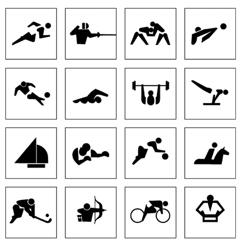
The success of the Tokyo team’s design philosophy carried over into and evolved in the 1968 Mexico City Games. For Mexico City, graphic designer Lance Wyman incorporated elements of indigenous folk art and psychedelia into his pictograms. The legacy of his Mexico City design can be traced throughout the 1970s. Check out more of this revolutionary design work.
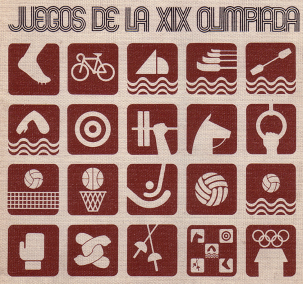
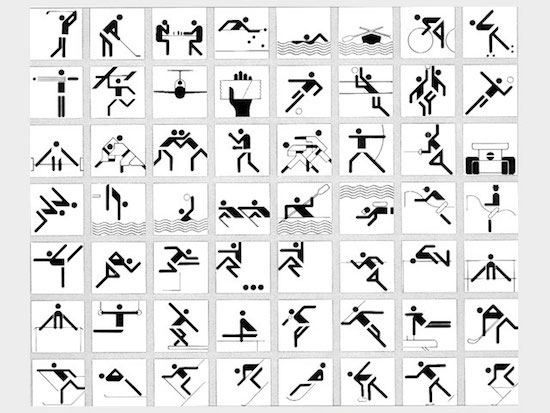
For the Munich Games in 1972, Otl Aicher took pictograms to a new level by placing geometrically complimentary lines within a grid system that provided structure. The Munich design has become the standard system we see at Olympic Games today.
Essentially human
Olympic pictograms facilitate a global audience, gathered together in a foreign locale to enjoy shared experience. A tall order. To do that, they sidestep language altogether. Instead, referencing the root, pictograms look to the reality words represent. They present that reality using the near universally recognized shape of the human body, placed in different positions and contexts to indicate an event.
When you think about the problem, the solution seems so simple, so obvious—the revival of a fundamentally human language.
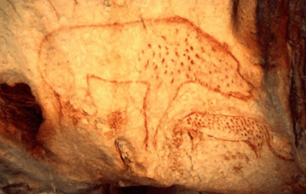
Our most ancient ancestors used pictograms to record their most important memories and hopes.
Almost any kindergartener will show you that using small drawings to capture people, places and things is basic to human communication.
Pictograms are as essential as human speech.
photo by Jerry Wang
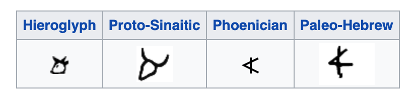
Archeologists believe modern alphabets evolved from the sounds and shapes associated with hieroglyphs. Our letter A started with from the shape of an ox’ head which corresponded to the word for ox, Aleph.
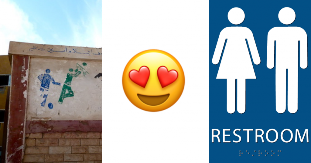
Today, pictograms remain ubiquitous in all of our modern landscapes—as much a part of our language as the letters on this screen.
Ways we read pictograms
The concept of visual literacy is complex and can be controversial. Though not a subject this article, there is some “grammar” involved in reading pictographs.
Pictograms are designed to transcend written language. They are images that take the place of words. They are for communication, not art. They aren’t open to individual interpretation. If you “interpret” a sign designated for diving is the sign for long jumping, you will end up at the wrong venue.
“Information consists of differences that make a difference.”
Edward R. Tufte—Envisioning Information p.65
Sports are represented symbolically, not precisely, with pictograms. It isn’t important to show precise details of a sport or action. Rather, showing a moment or element that both represents the sport and is distinguishable from related activities is key.
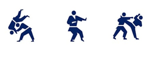
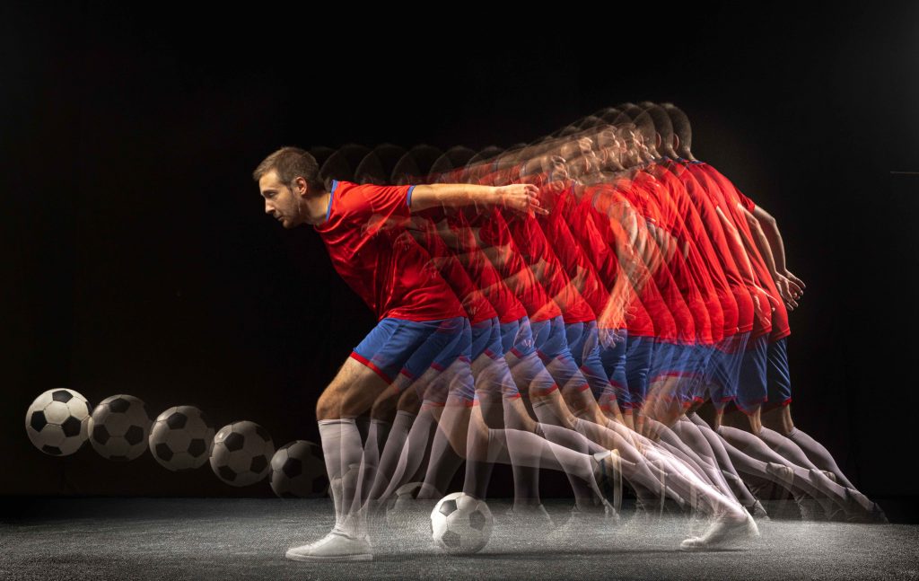
Stop action is the most familiar form for an Olympic pictogram. As if illuminated by a strobe light, the pictogram reimagines a singular moment of athletic motion. Designers take the most iconic and recognizable moment of an athletic movement to create a pictogram.
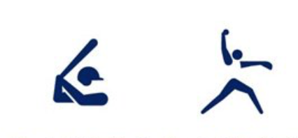
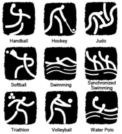
Context situates the particular pictogram within a specific game and country. Olympic pictograms are not a single form. For each game, the designers imbue the pictograms with elements from their culture, from the history of the games, the tradition of pictograms and the event they are representing. Knowing something about these elements is vital to being able to read pictograms. If you don’t know about pitching, you might be confused by which sign is for baseball and which is for softball.
Abstraction is also a key element of pictography. For each Olympic Games, the host city redesigns pictograms to add design elements unique to the that city. These are often cultural clues drawn from history or geography. To fully appreciate the abstract forms of the 2008 Beijing pictograms, you need to know something about Chinese writing.
Learn more
There are so many layers to graphic design. I hope you found something new and intriguing in this short article.
I love this subject because I believe communication is key to being human. Visual communication is complicated because it’s abstract and more subjective to the receiver than are written words. We each see through a lens colored by personal experiences, psychology, culture and more. Unravelling this is kind of mysterious and fascinating.