The Global Brand
The world’s finest athletes are currently gathered in Tokyo to compete in the delayed 2020 Olympic games. As a fan of both athletics and design, I want to recognize an easily overlooked champion. The Olympic rings, one of the most recognizable brands in the world.
According to IOC (International Olympic Committee) research, the Olympic logo has reached “global” status, with 95% of the world recognizing the famous five rings. High ideals associated with the rings include “inspirational, excellence, optimism and diversity.” (1) Any global organization aspires to brand associations like these.
Brand recognition this strong doesn’t happen overnight. It takes about 100 years.
Man, mission and mark.
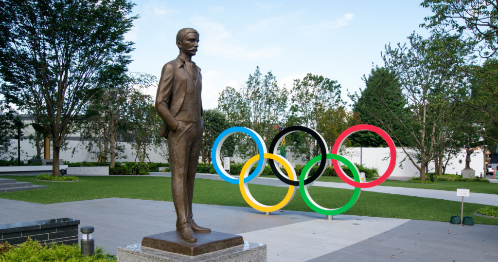
The father of the modern Olympic Movement was Pierre De Coubertin. A scholar in the field of education (particularly the role of physical competition), Coubertin reimagined the ancient Grecian Olympic games as a vehicle for elevating humanity, promoting peace and creating cross-cultural understanding. He was not so much an athlete as a philosopher of sport (although he did win an Olympic gold medal in Literature in 1912, when arts were included in the games).
Olympism did not reappear within the context of modern civilisation in order to play a local or temporary role. The mission entrusted to it is universal and timeless.
— PIERRE DE COUBERTIN
De Coubertin envisioned, and tirelessly promoted, the revival of the Olympics as a permanent fixture. He understood that building a movement and brand takes time and commitment. He also understood symbolism. The games themselves, while true competitions, are also symbolic of human ideals, both of character and community.
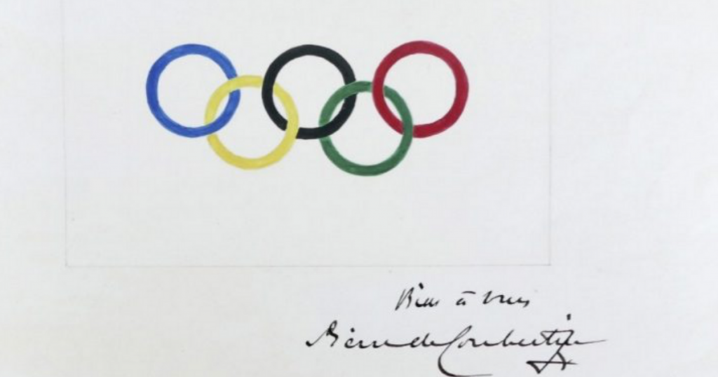
De Coubertin’s idealism and philosophy can clearly be seen through his inspired design of the Olympic rings. In it we find global reach, inclusion and a connected whole built by collaborative competition, all markers of the Olympic ideal. De Coubertin was not a graphic designer. He was a true believer. Passion, vision and imagery empower movements. That he was able to capture this vision in a clean and minimalistic design is also an amazing feat for an amateur.
Interlaced meaning
The Olympic logo, (known within the IOC as the “Olympic rings”) consists of five interlocking rings. Originally the five rings stood for the five areas of the globe from which athletes competed: Europe, The Americas, Africa, Asia and Oceania.
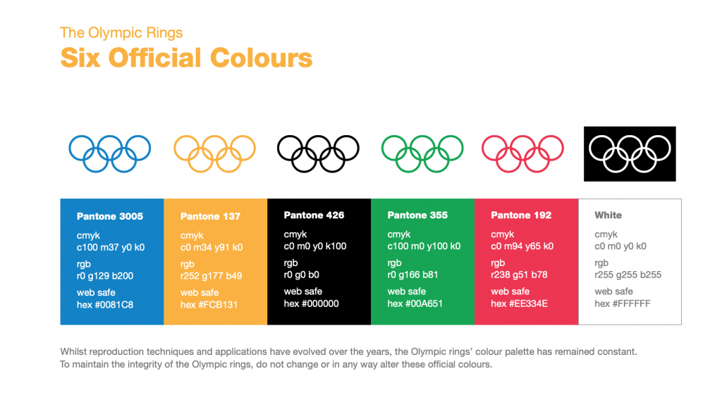
The Olympic rings contain five colors (from left to right, blue, yellow, black, green and red) against a white background. These do not relate directly to the geographic regions that the five rings represent. Instead, the colors, including the white background, are drawn from the flags of every nation competing in the games.
Interlocking rings express the unifying vision of the games. Each individual ring maintains its integrity as it links together into a freshly defined and expanded whole. None of the rings is forced to lose its integrity, nor is any ring greater than the collective whole.
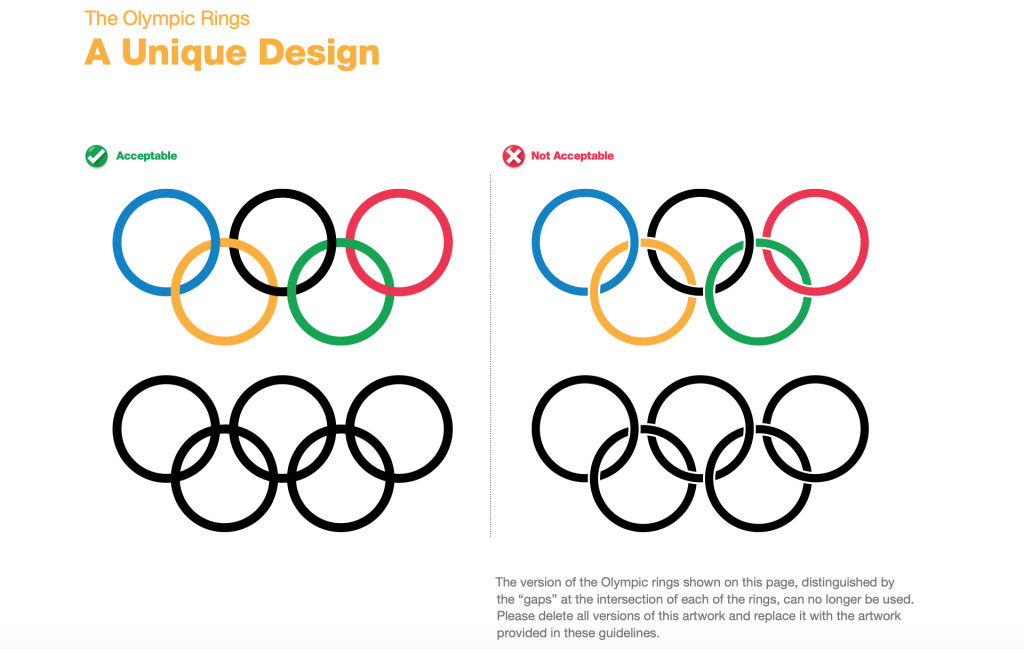
This is an important distinction. In most corporate brand marks, the aim is singularity and distinctiveness. Ford’s logo stands for Ford Motor company, not Ford and all of its suppliers and dealers. Companies strongly defend themselves against any alternative definition. Generally, brand marks never show the underlying and/or tangential assets from which they emerge.
The Olympic rings, on the other hand, represent and celebrate an open collaboration between people and nations. The brand suggests that the strength is in the coming together of competitors from disparate places and cultures. Without this collaboration there can be no Olympic event.
When I watch the Olympics, I see an idealistic world event. I see a hopeful gathering that reaches peak goodness when it’s attended by every possible competitor and every country. I see idealism in the games, and I see idealism in the Olympic rings.
Protecting an expanding brand
The IOC maintains strict guidelines for the use of the Olympic rings. These apply to host cities, broadcast partners, sponsors, businesses selling licensed merchandise and even athletes. Some critics feel these restrictions are excessive and negatively affect people’s perceptions of the games. A specific concern involves the IOC vigorously enforcing their brand controls⏤even on casual, non-business-related, usage of Olympic material by fans on social media.
Professionally, I recognize and support protecting the image, marketability and future of the games. Trademark and brand integrity require huge investments and are central to the IOC’s mandate. Considering the many political and economic upheavals of the last 120 years, I’d say they are savvy stewards of the brand and I believe they’ll find their way through social media mine fields.
Under tight control, the Olympic rings are still found on everything from the sides of mountains, to licensed swag, to athletes’ tattoos. In our next article, we’ll look at how Olympic design evolved into the immersive experience that accompanies all Olympic games and their host city.
Whether expressed in medal design, architecture, video games or even Kim Kardashian lounge wear, the unifying anchor of all Olympic design remains the Olympic rings, their history and vision for a better world that they embody.
(1) OLYMPIC Brand and Activation Guidelines. International Olympic Committee. (2013) p. 33
https://g14pool.files.wordpress.com/2014/12/ioc_guidelines_rhb_0715131.