Thumbs up!
It’s the holiday shopping season––snow is falling, bells are ringing, and people are all headed downtown to the department stores to help Santa with his list.
No. No, they aren’t.
If they’re like me, they’re thumb scrolling their way across various shopping sites looking for that perfect French bulldog tumbler or rustic garden trowel. In fact, almost 1/3 of all retail sales are transacted on a mobile device, and that number is only growing.
Santa is mobile now. With all the gifts he has to get, Santa needs websites designed to be easy, efficient, fast and comfortable to use with only one hand. (The other is busy with reindeer, chimneys, cookies and the like.)
As we continue our series on UX (User Experience) web design, let’s take a closer look at the physicality of web design. Let’s focus on our thumbs.
Swipe left. Swipe right.
Ten years ago, websites were being upgraded to include responsive design. Now more than half of all web traffic goes over mobile devices. Mobile apps and mobile versions of a website should anticipate the way people interact with a phone to facilitate easy and fast navigation.
A great example is Tinder’s “swipe left, swipe right” search method. It’s a super easy and economical movement that has become a cultural touchstone synonymous with Tinder’s brand. Tinder’s content display was built to facilitate ergonomically efficient touchscreen interactions. Some designers call this “thumb friendly.”
Thumb Friendly
There are three elements to the principle of “thumb friendly” design:
Understand the role of the thumb. When holding a phone in your hand, you can most easily activate the touch screen by using either your free hand or the thumb on the hand holding the device. Assuming that people are often multitasking while looking at their screen, incorporating movements for the thumb make sense. On a right-handed person, the thumb pivots and swivels from the right bottom corner of the screen.
Design to natural thumb movements. The thumb can easily move up and down. It can tap the phone and it can swipe left or right. Designers build devices to facilitate natural movements such as tilt, pinch, zoom, tap, double tap, swipe, scroll and more.
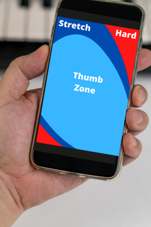
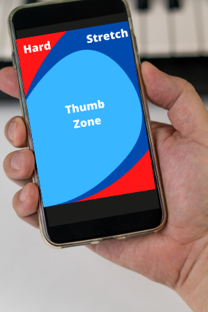
Because these movements can be done with the thumb on the same hand holding the phone, as much as possible, UX web design should make navigation and important content choices accessible by locating them within the “thumb zone.”
Use the thumb zone as your guide. When designing mobile pages, keep the images below in mind. They are a good template for creating thumb-friendly web design because they’re focused on optimizing ideal ergonomic movements.
UX 2022 Series
In 2022, good UX has become the standard for good website design. In this series we look more closely at important UX features, learn how they work and how they can improve a website.
Here are other articles in this series:
Core Web Vitals: Google’s Three Essentials to User Experience.
Speed: Slow websites are quickly abandoned.