Can a Logo Make You Hungry?
Every time we’re asked to design a logo for a client, I’m reminded of something I saw on a now-cancelled NBC show, “America’s Next Great Restaurant.” In the episode, Steve Ells, celebrity judge and founder of Chipotle Mexican Grill, criticized a contestant’s logo, saying it didn’t make him hungry.
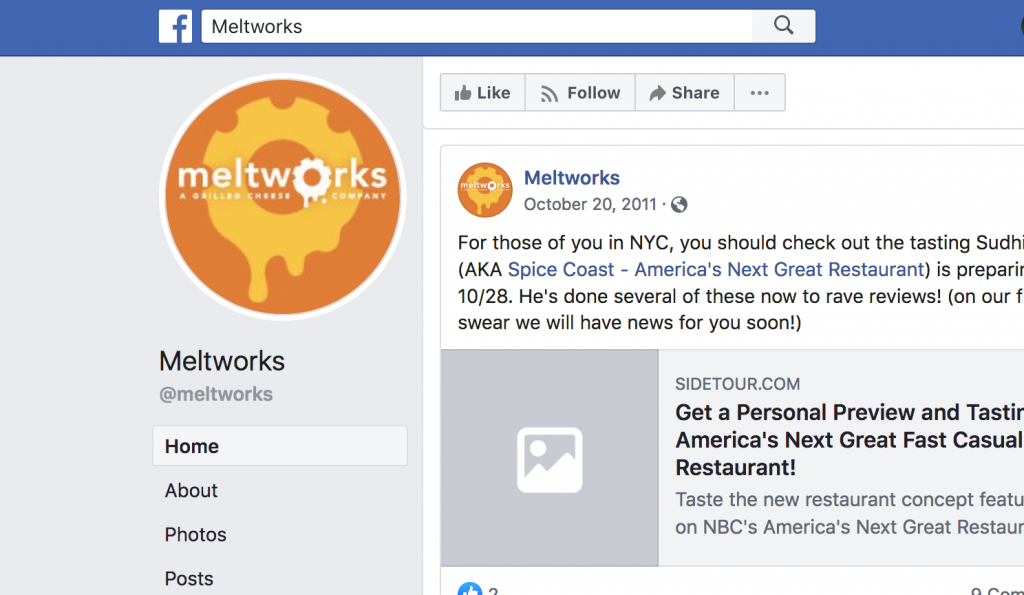
The logo was for a concept called “Meltworks,” and featured a melting cog for the letter “O.” Ells said he “got it” and thought it was “kind of fun,” but advised the would-be restaurateur to “put something that represents food in the logo.”

As I considered this advice, I flipped through logos for well-known food purveryors: McDonald’s, Subway, Starbucks, Ben & Jerry’s, TGI Friday’s … None of them feature an image of food in their logos. But, given their success, they must be making someone hungry.
Then, I looked up the logo for Ells’s Chipotle restaurant chain. It features a chili, which signifies food and even suggests a certain kind of food. But does it make me hungry? Better still, is it even possible for a logo to make someone hungry? According to a study involving the Red Bull logo, the answer may be yes.
Red Bull’s Logo Gives You Wings
In the experiment, subjects played a car-racing video game. Each time they played, the game was the same, but the logo on the car they controlled changed to that of a different famous beverage brand. When the car bore the Red Bull logo, researchers found that players drove faster and more recklessly.
Other parts of the study confirmed that people associate “speed” with Red Bull more than any other attribute, and that they associate “speed” with Red Bull more than they do with any other brand.
So, it is possible for a logo to elicit a visceral response, but Red Bull’s logo, which features two bulls face-to-face, doesn’t literally scream “speed” to me. Nor does McDonald’s logo literally say “eat here.”
Does a Logo Have to Be Literal?
These well-known logos get a response not because they look like what their owners sell, but because they have been carefully associated with what they represent through various forms of communication.
For example, Red Bull sponsors a lot of sporting events. But you won’t see their logo at a bowling tournament or a figure skating contest. You’ll see it at the Ice Crash or the Flugtag. (Check out the opening scene from this video of Red Bull’s X-Fighters.)
Seeing a visual mark in a certain context consistently over time creates the connection, not the image itself. It’s a bit like Pavlov’s famous experiment. The bell ringing didn’t make the dogs hungry until they knew they were going to get food right after hearing it. If Pavlov had merely been searching for a sound that makes dog’s hungry, his arms would have gotten really tired.
Ells may have had a point, though. Food is a basic human need, and an image of food does have inherent meaning. So, a chili or a hot dog might give passersby an important cue. But, like Pavlov’s bell, I don’t think a logo will make anyone hungry until after they learn what it means through some kind of experience.
