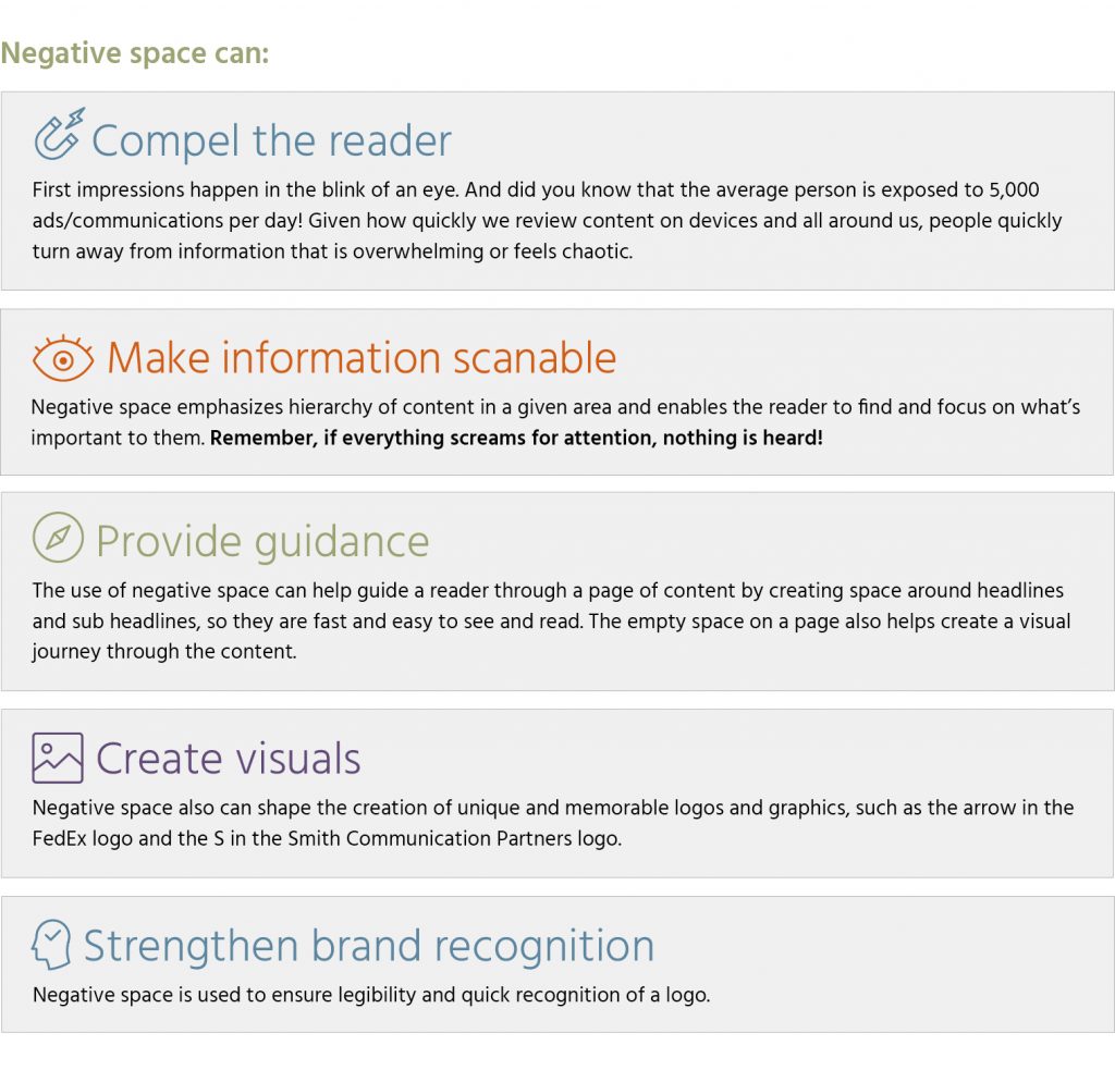
Negative space is a positive thing.
Space.
Personal space, office space, open space, dead space, green space, storage space, outer space. We all need space.
As a graphic designer, there’s one kind of space that often gets a bad rap – that’s negative space, or the space that surrounds a subject or focus of a design. Many clients are uncomfortable with negative space or feel it is wasteful and cannot resist the urge to fill it. But negative space truly is a positive thing. Let’s explore why.
People shouldn’t have to work hard to absorb content. One of the most common complaints from clients is that employees don’t read. One way to engage employees is to make it easy for them to absorb content and compel them to read. That means making the composition of the content balanced, visually appealing, minimizing copy and enhancing content with visuals that support or explain the subject matter. In other words, eliminate the feeling of chaos.
If you have a lot of content that needs to be conveyed, consider the following:
- Determine what is truly necessary.Stick to the top three things you want people to remember or take action on. As a communicator, you are a subject matter expert, so you have the full picture and its details in your head. But most often, people don’t need all of that detail.
- Layer information.That means focus on the top three things, then provide direction to where more information can be found. This will keep your abstract thinkers happy as they typically don’t want all the details and keep your concrete thinkers satisfied because they can access more detail.
- Incorporate visuals that offer meaning and provide a “break.” Leverage visuals, such as photographs, icons and infographics that provide a break from all of the words and enhance the meaning of the content. This is especially important given 65% of the population are visual learners!
- Use negative space effectively.As covered earlier, negative space is your friend and will help keep people engaged and make content scannable.
Granted, there may be situations where you can’t get around dense content, like legal notices. But even then, hierarchy is everything and can create a positive experience for the reader that truly wants to find specific content or read all of the content.
You see, negative space IS a positive thing!