Passage in Purple
Pantone was very sensitive to the global crisis when they chose 2021’s dual Colors of the Year. The combination of a bleak Ultimate Gray and a bright Illuminating yellow both acknowledged the dread of the pandemic and pointed toward a brighter tomorrow.
Pantone’s choice for 2022’s Color of the Year is also pandemic-inspired. In Very Peri, Pantone subtly presents 2022 as a year of emergence from struggle toward renewal and hope.
“We are living in transformative times. Very Peri is a symbol of the global zeitgeist of the moment and the transition we are going through. As we emerge from an intense period of isolation, our notions and standards are changing, and our physical and digital lives have merged in new ways.”
Pantone Color Institute
Half-mourning
It’s not an accident that Pantone turned to the traditional half-mourning color. Elaborate Victorian grieving conventions adopted the use of shades of purple to signal the passage from grief to a resumption of life. Purples were worn after a dark period of pain and isolation––not as dire and stark as black, yet not back to full radiance. As the mourning period progresses, purple could shade from deep noir eggplant to light and airy lavender.
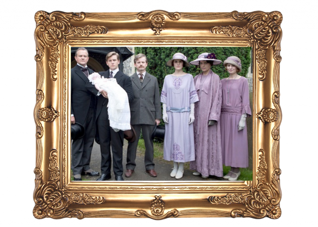
The ladies of Downton Abby wear shades of purple
while simultaneously mourning Lady Sybil’s death
embracing the new life of her child.
Transition is key here. As we continue working ourselves out of the deep shock of a global pandemic, it’s fitting to remember all that’s been lost. Survival depends on an element of memory. Yet, survival is wasted if we do not get on with living.
In a year where not just living, but thriving, will require us to make the transition from remembering to renewing, Pantone’s Very Peri seems very timely.